> ## Documentation Index
> Fetch the complete documentation index at: https://guide.daro.so/llms.txt
> Use this file to discover all available pages before exploring further.
# Native Ads
> Implement native ads in your React Native app.
## Native Ad Format
* Unlike other ad formats where the SDK renders the complete ad view, native ads hand you the individual components so you build the ad view yourself inside your app.
* The main benefit is that you lay the ad out to match your own UI/UX, so it feels much less intrusive. To keep users from mistaking an ad for regular content, you must still give it a minimum level of visual differentiation along with an ad indicator.
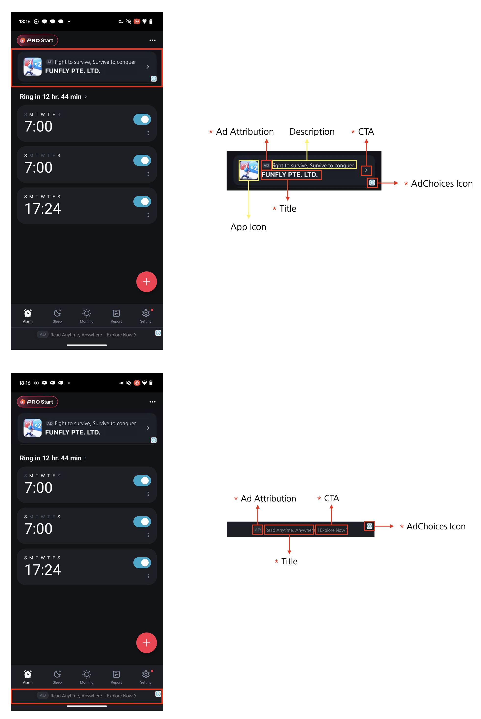
**Four required native ad elements**
You are free to design a native ad to fit your app's UI, but the **four elements below are required**. This is an ad policy: it keeps users aware that they are looking at an ad, and it guarantees the minimum ad performance advertisers expect.
1. Ad indicator: add an "AD" or "Sponsored" label to the ad area so users can clearly tell it is an ad.
2. AdChoices icon: the AdChoices icon lets users identify and control the ad, and is usually shown as an 'ⓘ' glyph. The DARO SDK inserts it automatically so you do not implement it yourself, but lay out the ad view so that nothing covers it. Its shape and behavior can differ by ad demand source.
3. Title: display the ad's title.
4. Call to action (CTA): always include a CTA button such as "Install", "Open", or "Download". You can size and style the button freely, and replace it with a text field where that fits better. The ad demand source supplies the CTA copy, so do not hard-code your own.
***
## Implementation
```tsx theme={null}
import { useRef } from "react";
import { Button, StyleSheet, Text, View } from "react-native";
import {
BodyView,
CallToActionView,
IconView,
MediaView,
NativeAdView,
TitleView,
} from "react-native-daro";
import type { NativeAdViewHandler } from "react-native-daro";
```
## Creating the native ad view
`NativeAdView` loads an ad when the component mounts. To load another ad, call `loadAd()` on the ref.
```tsx theme={null}
const NATIVE_AD_UNIT_ID = "YOUR_NATIVE_AD_UNIT_ID";
export default function NativeAdExample() {
const nativeAdRef = useRef(null);
return (
{
console.log("Native ad loaded", adInfo);
}}
onAdLoadFailed={(errorInfo) => {
console.log("Native ad failed to load", errorInfo);
}}
onAdClicked={(adInfo) => {
console.log("Native ad clicked", adInfo);
}}
onAdImpressionRecorded={(adInfo) => {
console.log("Native ad impression recorded", adInfo);
}}
>
AD
);
}
const styles = StyleSheet.create({
container: {
gap: 12,
},
nativeAd: {
width: "100%",
padding: 12,
borderRadius: 8,
backgroundColor: "#F5F6F7",
},
header: {
flexDirection: "row",
gap: 10,
alignItems: "center",
},
icon: {
width: 48,
height: 48,
borderRadius: 8,
},
titleArea: {
flex: 1,
gap: 4,
},
adBadge: {
alignSelf: "flex-start",
paddingHorizontal: 6,
paddingVertical: 2,
borderRadius: 4,
backgroundColor: "#D9DEE3",
},
adBadgeText: {
fontSize: 10,
fontWeight: "700",
color: "#222222",
},
title: {
fontSize: 16,
fontWeight: "700",
color: "#111111",
},
body: {
marginTop: 8,
fontSize: 14,
color: "#333333",
},
media: {
width: "100%",
height: 180,
marginTop: 10,
borderRadius: 8,
overflow: "hidden",
backgroundColor: "#E5E7EB",
},
callToAction: {
marginTop: 10,
paddingVertical: 10,
borderRadius: 6,
overflow: "hidden",
textAlign: "center",
fontSize: 15,
fontWeight: "700",
color: "#FFFFFF",
backgroundColor: "#1F6FEB",
},
});
```
The ad components nested in `NativeAdView` (`IconView`, `TitleView`, `BodyView`, `MediaView`, `CallToActionView`) must always render. If you hide them behind a conditional, the ad loads but never appears.
## AdChoices position
The SDK shows the AdChoices icon automatically. Use the `adChoicesPosition` prop to state where you would prefer it. When you omit it, `bottomRight` is used.
```javascript theme={null}
{/* ad components */}
```
The available values are `topLeft`, `topRight`, `bottomLeft`, and `bottomRight`.
`adChoicesPosition` states a preference. The actual position can differ by ad demand source, so leave enough padding in all four corners when you lay the ad out.
## Adapt the UI to received assets
* Use the `onNativeAdAssetLoaded` prop on `NativeAdView` to handle missing assets.
* The callback receives `ReadonlySet`. Check membership with `.has()`.
| Value | Meaning |
| - | - |
| `TITLE` | Ad title |
| `BODY` | Ad body text |
| `ICON` | Ad icon |
| `MEDIA` | Ad image or video |
| `CALL_TO_ACTION` | Call-to-action button text (e.g., Install) |
| `ADVERTISER` | Advertiser name (iOS) |
```tsx theme={null}
import { useState } from "react";
import { Text } from "react-native";
import {
NativeAdView,
NativeAdAssetType,
TitleView,
BodyView,
IconView,
MediaView,
CallToActionView,
} from "react-native-daro";
export function NativeAdWithAssetVisibility() {
const [assetTypes, setAssetTypes] = useState | null>(null);
const display = (type: NativeAdAssetType): "flex" | "none" =>
assetTypes === null || assetTypes.has(type) ? "flex" : "none";
return (
AD
);
}
```
* Keep asset views mounted and switch their display between `"none"` and `"flex"` instead of conditionally removing them.
* There is no dedicated React Native view component for `ADVERTISER`.
* Bridge callbacks are asynchronous and do not guarantee synchronous UI updates with the native view.